「这很难评测」是一种产品坏味道
Hamel 今年最重要的一篇。它把 eval 的起点从「产品做完之后」前移到「设计产品之时」:难评测不是评测方法的问题,而是产品设计的问题。三个真实咨询案例(数据 Agent、教案生成器、工伤医疗报告)给出前后对比的界面草图,把「为可验证性而设计」讲成了可直接套用的模式。
核心内容速览
- 难评测 = 产品坏味道:你难以验证的产物,用户同样难以验证——最坏情况是用户从头重做一遍。为「易于验证」而设计产品,应先于构建 evals。
- 可检查产物(checkable artifacts):不要只给答案。给出假设与指标定义、中间计算、出处链接,以及一份明确的「无法验证事项」清单(数据 Agent 案例:从一句话答案到可发布的 notebook)。
- 锚定可信基线 + diff 审查:从经过审核、正在真实使用的教案出发,教师只需审查 2 处带理由的改动,而不是从头判断整份教案——审查范围越小,eval 的表面积越小。
- 把报告生成器改成研究助理:50 页医疗报告无法整体验证;先引导医生逐条核对矛盾、关键事实、未决问题,再从已验证的事实组装成品。
- 四个设计问题:用户实际要检查什么?能和什么可信的东西比较?专家用什么启发式?能接受/编辑/拒绝的最小单元是什么?
适合谁 · 怎么用
所有正在做 AI 产品的人,尤其是说过「我们的产品没法评测」的团队——这篇告诉你答案在改产品,而不是改评测。建议放在 a02(评测机制)之前读:它是所有评测工作的前置条件。
闯关自测
先合上原文在心里作答,再点开对照。全对 = 本篇真正通关。
Q1 为什么「难评估」是一种产品坏味道?
你难以验证的产物,对用户同样难以验证——最坏情况用户要重做一遍工作来确认输出。所以为「易于验证」设计产品应先于构建 evals,而不是事后补评测。
Q2 「锚定基线 + diff 审查」模式是什么?
从经过审核、正在真实使用的产物(如别的教师在用的教案)出发做最小适配,用户只需审查少量带理由的 diff,而不是从头判断整个产物——认知负担和 eval 表面积同时缩小。
Q3 一个「可检查产物」应包含哪些要素?
假设与出处(如指标定义来自哪里)、中间计算过程、可下钻的明细数据、明确的「无法验证事项」清单,并用渐进式披露控制信息量,随用户信任增长调整默认展示。
以下为全文 · 中文翻译
上方为本站原创导读,下方为英文原文的完整中文翻译(经分析→翻译→审校→润色全流程精翻);英文原文折叠收于翻译之后,可展开逐句对照。
过去 3 年,AI 评测一直是我的职业重心。1 关于评测,我最常听到的反对意见是「我们的产品很难评测」。
这种反对意见是一种产品坏味道。对你来说难以验证的产物,对用户来说往往也难以验证。最坏的情况下,用户不得不从头重做一遍工作来验证输出。更重要的是,为「易于验证」而设计产品,应该先于搭建评测。
在这篇文章里,我会带你走过三个我做过咨询、并遇到过这个问题的产品。我还会用改造前后的草图来演示设计原则。在这些案例之后,我会讨论如何把这个通用模式应用到你的产品上。
案例一:AI 数据 agent
几乎每一家我合作过的公司都在搭建内部的 AI 数据 agent。你向它提一个业务问题,比如「Product A 上个季度的净营收是多少」,它会找到相关的数据源,运行查询,并给出答案。这个 agent 的目标是降低对数据分析师的依赖。
搭建 AI 数据 agent 时一个常见的错误,是把答案当作唯一的输出,如下图所示。
在上面的草图中,用户除了重做一遍工作之外,没有任何办法验证答案。2 更好的设计是参考领域专家验证输出的方式,给用户提供可核查的产物。以下是我作为数据科学家验证指标时常用的方法:
- 把这个数值和任何中间计算,与可信来源对照——比如一个已审核的仪表盘或报告,或者同事已经审核过的类似分析。3
- 精确确认指标定义。像净营收这样的数字,可以包含也可以排除退货和折扣之类的项目。
- 对一个相关数值做合理性检查。如果我无法直接验证这个数字,我会取一个应当随它联动的相关数字,比如销量或唯一客户数,检查这个组合是否合理。
- 查看聚合值之下藏着什么。总数会掩盖问题,所以我会按地区或时间段等维度把它拆开,对分布做合理性检查。
- 读查询语句。对重要的数字,我会看 SQL 来确认它做的和我以为的一致,并且我会改动它、重新运行,来检验我的假设。
- 记下任何我无法验证的东西。如果某一步没有可信参照可以对照,我会把它标记出来,而不是当作已定论呈现。
更好的界面可能长这样。下面的两个标签页以两种详细程度展示同一个答案:对话回复把值得先看的细节浮现出来,notebook 则装着答案背后的完整分析。用标签页在两者之间切换。
明细
这是 agent 在产出答案时工作的 notebook。在图中滚动即可查看所有单元格。侧栏有一个「目录」标签页用于在章节之间跳转,还有一个「助手」标签页用于继续追问。
净营收 —— Product A,Q4 FY25
「Product A 上个季度的净营收是多少?」
简短回答:$4.21M。这个 notebook 展示了这个数字是如何构建的,以及哪些内容与可信来源做过对照。
1. 指标定义
净营收是 gross − returns − discounts。从受治理的指标层读取定义,以保证与财务汇报的口径一致。
Python▶代码已折叠✦ 询问 AI ⌘K
import yaml

defn = yaml.safe_load(open("metrics/net_revenue.yml"))
defn["expr"], defn["source"]
2. Product A 的净营收
直接从订单行中取 Product A 本季度的净营收。
SQL▶代码已折叠✦ 询问 AI ⌘K
SELECT SUM(gross - returns - discounts) AS net_revenue

FROM   finance.order_lines
WHERE  product = 'Product A'
  AND  fiscal_quarter = 'Q4-FY25';
| net_revenue |
|---|
| 4,210,442 |
这就是对话答案里报出的 $4.21M。
3. 对分布做合理性检查
把 Product A 按地区拆开,然后画图。与上个季度的结构相比,不应该有任何看起来不对劲的地方。
SQL▶代码已折叠✦ 询问 AI ⌘K
SELECT region,
       SUM(gross - returns - discounts) AS net_revenue

FROM   finance.order_lines
WHERE  product = 'Product A'
  AND  fiscal_quarter = 'Q4-FY25'
GROUP BY region;
| region | net_revenue |
|---|---|
| West | 1,740,000 |
| Central | 1,160,000 |
| East | 890,000 |
| Intl | 420,000 |
Python▶代码已折叠✦ 询问 AI ⌘K
m = by_region.set_index("region")["net_revenue"] / 1e6

m.plot.barh(title="Net revenue by region · Q4 FY25")
West 和 Central 贡献了大部分营收,International 只占很小的一段尾部。
4. 我无法验证的内容
有两个输入没有可信来源可供对照。我没有把它们当作已定论,而是各自留在下面,作为你可以运行和编辑、深入挖掘的单元格。
SQL▶代码已折叠✦ 询问 AI ⌘K
-- agent 给出的 -$0.7M 退货数字是估计值;

-- 请检查 returns 表中 Q4 的行来佐证它
SELECT COUNT(*) AS n_rows, SUM(amount) AS returns
FROM   finance.returns
WHERE  product = 'Product A'
  AND  fiscal_quarter = 'Q4-FY25';
| n_rows | returns |
|---|---|
| 0 | NULL |
所以那个 −$0.7M 目前还没有可供对照的来源。另一个待决项是客户表的连接:
SQL▶代码已折叠✦ 询问 AI ⌘K
-- 12,480 个唯一客户中有 183 个在 Billing 里而不在 CRM 里,

-- 因此有些营收无法归属。把它们取出来:
SELECT b.customer_id, b.amount
FROM   billing.invoices b
LEFT JOIN crm.customers c USING (customer_id)
WHERE  c.customer_id IS NULL
ORDER BY b.amount DESC
LIMIT 5;
| customer_id | amount |
|---|---|
| BIL-44821 | 18,400 |
| BIL-39105 | 12,950 |
| BIL-50277 | 9,310 |
| … | … |
这 $61,540 的营收,其客户归属尚不确定——把它浮现出来,是为了让一个人在总数被信任之前把它解决掉。
我用财务的受治理定义,从订单行中取出了 Product A 的净营收,按地区做了拆分,并标记了我无法验证的内容。单元格在左侧。
这里有很多值得拆解的地方。以下是几个显著变化:
- agent 可以选择性地从已审核的分析中检索,界面会显示使用了哪一份分析以及作者是谁。
- 细节采用渐进式呈现。聊天回复中展示高价值的信息,比如来源、假设和问题。用户可以选择打开一个交互式 notebook,查看完整上下文。
- AI 生成的 notebook(见上方 notebook 标签页)的组织方式是为了促进核查:它首先列出 agent 所做的假设,比如指标定义及其出处,然后展示它运行的查询和返回的数字。它把总数拆开,让你可以对分布做合理性检查,最后列出它无法验证的内容,每一项都保留为一个可运行的单元格。
- AI agent 在 notebook 中也可用,可以帮助处理后续追问。最后,用户可以把 notebook 发布回知识库,供未来的分析检索,从而形成良性循环。
这个设计草图远非完美。重点是:产品应该帮助用户像领域专家那样去验证答案。把它和之前的做法对比一下——之前的输出只有那个数字。
这样的数据 agent 并不是科幻。Hex4 是我在这类产品中最喜欢的;它把 notebook 和聊天的结合做得比我见过的任何东西都好。以下是它们官网的截图:
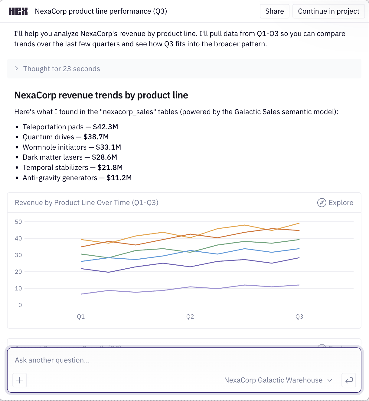
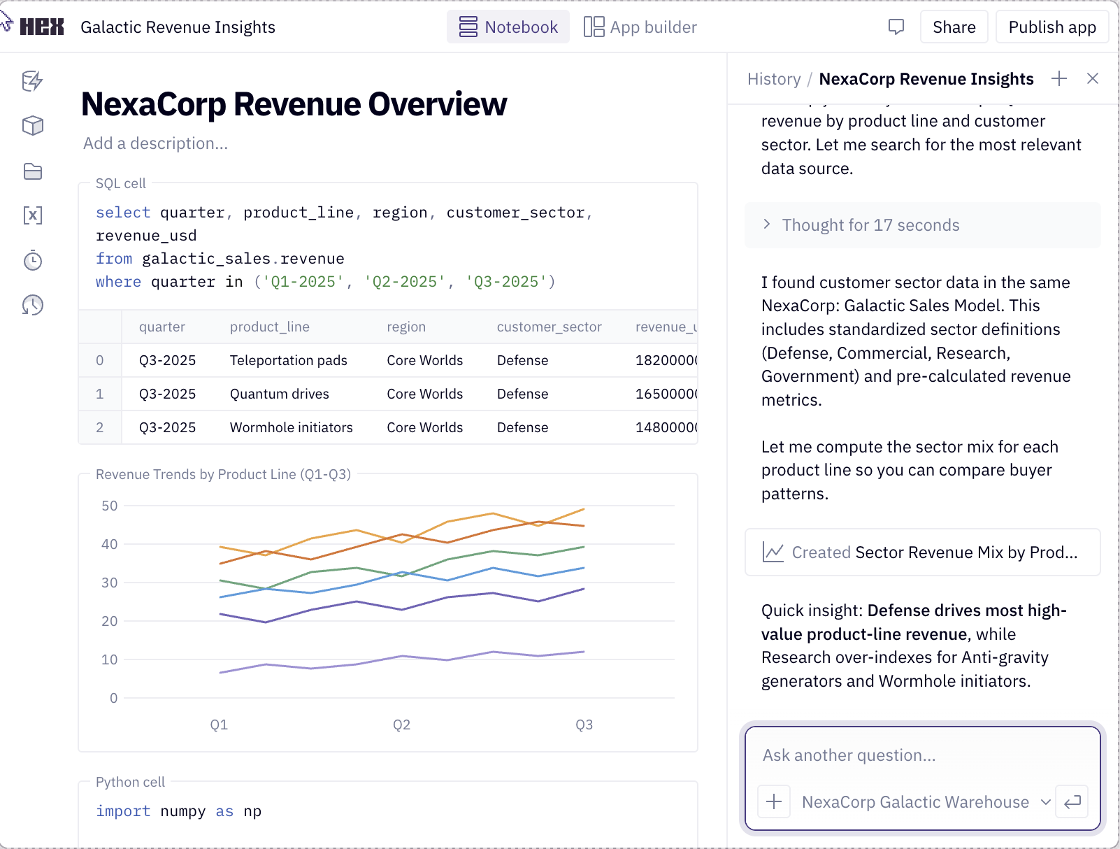
但这和评测有什么关系?如果你为「可验证」而设计产品,标注的成本就会降低,评测也能从中获得更好的信号。更重要的是,你会为用户提供一个更好的产品。
案例二:体育课教案生成器
我指导过的一位创始人正在做一款 AI 工具,为 K-12 教师编写体育课教案。教师输入他们的约束条件,比如所教年级、课时长、室内还是室外上课、有什么器材。工具然后根据这些约束写出一份教案。目标是节省教师备课的时间,并给他们一份贴合自己课堂的教案。下面是这个产品的草图:
沿场地周边慢跑,然后做动态拉伸:手臂绕环、弓步和高抬腿。最后以两人一组的抛接球收尾,活动开手部。
学生两人一组,锥桶间距 10 英尺。搭档先练习低手投掷,再练高手投掷。提示他们用异侧脚上步并随挥。随着准确率提高加大间距,每 5 分钟轮换一次搭档。
静态拉伸,并快速回顾投掷要领:上步、指向、随挥。
观察学生是否以异侧脚在前完成上步投掷、眼睛注视目标。记下下次课需要缩短投掷距离的学生。
12 个锥桶,6 个海绵球,3 个站位标志物。
这位创始人问我该怎么评测这些教案。我把问题反了过来:教师真正关心的是什么?
让一份教案快速获得信任的最快方式,是看到和自己类似的教师已经在用它。此外,教师也看重能了解别人在做什么,以便学习新的教学方法。因此,更好的设计可以从「正在学校里被实际使用的已审核教案」出发。当工具生成教案时,它显示自己基于哪份已审核教案、谁在用那份教案,以及它针对这位教师的约束做了哪些改动的 diff。
这样一来,教师只需对着一份自己已经信任的教案检查少量改动,而不用从零开始评判一整份教案。下面是更好的界面可能的样子:
在这个版本里,教案的大部分内容继承自已审核教案。教师的审查范围被收敛到少数几处编辑上,每一处都附有一条说明改动原因的理由。这是一种更高效的教案审查方式,因为它降低了从零评判一整份教案的认知负担。
朝这个方向设计也让产品更容易构建。工具不必再把几百个示例塞进 prompt,而是捕捉关键维度、检索一个相近的匹配项,然后加以改写。自动化评测也变得可行了,因为需要测试的表面积变小了。比如,你可以验证教案检索是否选出了合理的锚点,以及每一处编辑是否都遵守了约束条件。
案例三:工伤赔偿医疗报告
最后一个例子来自一位创始人请我帮忙的工伤赔偿工具。它读取患者的病历(入院问卷、影像报告、理疗记录、既往检查),生成一份很长的专家意见报告,通常长达五十页甚至更多。下面是这个产品的草图:
索赔人为一名 47 岁仓库员工,自述于 2025 年 3 月 3 日在搬运一个估计重约六十磅的纸箱时腰椎受伤。他描述当时立即出现腰痛并放射至右下肢,随后沿小腿外侧出现麻木。
已审阅的记录包括入院问卷、2025 年 3 月 18 日的腰椎 MRI、十二份理疗记录,以及截至 2025 年 8 月的主治医生病程报告。
查体示腰椎前屈受限至 40 度并伴有疼痛。右侧直腿抬高试验 50 度阳性。右侧踇长伸肌肌力 4/5 级,L5 支配区感觉减退。
L5-S1 腰椎间盘突出,伴相关右侧 L5 神经根病变,上述影像学与查体所见可予支持。
在合理的医学概率范围内,该椎间盘突出与 2025 年 3 月 3 日的工伤搬运事件存在因果关系。索赔人在该日期之前无腰椎治疗的记录病史。
问题和其他例子相同,但利害关系更大。唯一的输出就是这份报告,而医生是要对它负责的人。要信任它,他们就得回头翻病历,亲自确认事实和推论。这可能和从零写报告花的时间一样长,那这个工具就失去了意义。
你可能会反驳说,一份五十页的意见书本来就难以验证。这话没错,产品也不该假装不是这样。帮助医生理解证据,可以说比那份完成稿更有价值。因此,我建议这位创始人把产品做成研究助理,而不是报告生成器。
比如,产品可以读取每一份记录,抽出相关事实,并附回到原页的链接,让医生可以逐条核对。当两次检查结果不一致,或者病历留下悬而未决的问题时,产品应该把它凸显出来。医生随后可以解决矛盾、填补空白。最后,产品再用他们已经核查过的内容组装出最终报告。下面是这可能的样子:
这个产品的研究助理版本让医生可以边核查事实边建立信任。和其他例子类似,这种设计更容易构建,也更容易评估。现在有了可以评分的、范围明确的单元,比如某个矛盾是否真实存在,或者某条引用是否支持某个论断。
推广这一模式
理解用户如何验证你产品的 AI 产物非常重要。有时,这可能需要组装支持性证据。在另一些情况下,这可能意味着重构整个工作流,让用户处于环路之中(就像工伤赔偿的例子)。
下面这些问题可以指导你为「可验证」而设计产品:
- 用户真正需要核查的是什么?
- 他们可以拿什么可信的东西来对比?
- 专家在验证时会借助哪些信号或启发式方法?
- 他们可以接受、编辑或拒绝哪些更小的单元?
这些例子的一个共同主线是出处(provenance)。让一个输出可核查的最快方式,就是展示每个部分来自哪里,并附上链接以便查看更多细节。此外,你可以用渐进式呈现,避免这些来源把用户淹没。
需要验证什么,也会随着用户信任的增长而变化。早期,数据 agent 应该让出处显而易见,比如某个指标定义来自哪里。一旦用户信任 agent 能把它做对,这个细节就可以在卡片里默认折叠。好的设计是在用户所在的位置与他们相遇,而不是把所有东西都摆出来。
即使一个产品看起来容易评测,这些原则依然成立。编程就是个好例子:它是最可验证的工作类型之一,有测试、类型和 diff。即便如此,一些编程 agent 还会多走一步,让自己的工作可核查。Cursor 和 Devin 都会为它们所做的 UI 改动录制一段短视频,这样你不必亲自复现就能确认工作做对了。5
这些并不新鲜
评测思维与好的产品设计是一致的。收集支持性数据、把工作流拆成更小的单元,都会让自动化评分更容易。不过,我不想假装这里有什么智慧是新的。
所有这些想法都源自早已确立的设计原则。比如,在动手构建之前观察专家工作、了解他们会核查什么,这叫做需求发现(needfinding)。6 在医疗案例这类研究密集型工作中,有一个叫做意义建构(sensemaking)的设计目标,即对大量证据建立结构化理解、以便对其推理的工作。7 还有很多其他概念,但我想你已经明白了。
尽管这些想法早已确立,但在 AI 时代仍有必要提醒一下。在 AI 之前,验证常常是在产出工作成果的过程中顺带发生的。有了 AI,验证成了瓶颈。是时候更明确地去思考它了。
视频讲解
我录了一段短视频讲解这些例子。如果你更想观看而不是阅读,可以点这里:
感谢 Shreya Shankar 和 Isaac Flath 对本文的反馈。
脚注
AI 评测主题中心收录了我其余的评测相关工作。我也联合讲授 面向工程师与产品经理的 AI 评测课程。↩︎
Lenny Rachitsky 最近发过一条相关推文:一个数据科学团队的大部分工作现在变成了审查产品经理和工程师用 AI 做出的半成品分析,而其中一半是错的。↩︎
我在 Airbnb 工作时,我们有一个内部工具叫 Knowledge Repo,数据科学家在那里发布他们对分析、建模等深入研究的 notebook(他们在这里写过介绍)。它是了解新项目上下文最快的方式之一,因为你可以读到别人已经研究清楚的东西。我不知道它现在是否还在使用,但这个范式很好。↩︎
Bryan Bischof 主导了 Hex 的 AI 构建。Bryan 自己就是数据科学家,正是这个产品服务的那类领域专家,我认为这是它设计得好的部分原因。↩︎
可以看看 Cursor 录制其 UI 改动的演示,以及 Devin 关于测试与录制的文档。↩︎
Dev Patnaik 与 Robert Becker,《Needfinding: The Why and How of Uncovering People’s Needs》,Design Management Journal。↩︎
Daniel M. Russell、Mark J. Stefik、Peter Pirolli 与 Stuart K. Card,《The Cost Structure of Sensemaking》。↩︎
查看英文原文(English original)
For the past 3 years, AI evals have been my professional focus.1 The most common objection I hear to evals is “our product is hard to eval”.
This objection is a product smell. Artifacts that are hard for you to verify are often hard for users too. In the worst case, users have to redo the work from scratch to verify the output. More importantly, designing your product for ease of verification should come before building evals.
In this post, I’ll walk through three products I advised on that faced this issue. I’ll also show before and after sketches to demonstrate design principles. After these examples, I’ll discuss how to apply this general pattern to your product.
Example 1: the AI data agent
Almost every company I’ve worked with builds an internal AI data agent. You ask it a business question, like what was net revenue for Product A last quarter, and it finds relevant data sources, runs the queries, and provides an answer. The goal of this agent is to reduce dependency on data analysts.
A common mistake when building AI data agents is to make the answer the only output, as illustrated below.
In the sketch above, the user has no way to verify the answer beyond redoing work.2 A better design is to provide the user with checkable artifacts, informed by how a domain expert might validate the output. Here are techniques I use to validate metrics as a data scientist:
- Compare the quantity and any intermediate calculations against a trusted source, like a vetted dashboard or report, or a similar analysis a colleague has already vetted.3
- Confirm the metric definition precisely. A number like net revenue can include or exclude things like returns and discounts.
- Sanity-check a related quantity. If I can’t verify the number directly, I pull a related number that should move with it, like units sold or unique customers, and check if the combination is plausible.
- Look at what is beneath the aggregate. A total can hide problems, so I break it down by dimensions like region or time period and sanity-check the distribution.
- Read the query. For an important number I look at the SQL to confirm it does what I think, and I tweak it and rerun to test my assumptions.
- Note anything I could not verify. If a step has no trusted reference to check it against, I flag it instead of presenting it as settled.
Here’s what a better interface might look like. The two tabs below show the same answer at two levels of detail. The chat reply surfaces the details worth seeing up front, and the notebook holds the full analysis behind the answer. Use the tabs to switch between them.
Details
This is the notebook the agent worked in while producing its answer. Scroll within the figure to see all the cells. The sidebar has a Contents tab for jumping between sections and an Assistant tab for asking follow-ups.
Net revenue — Product A, Q4 FY25
“What was net revenue for Product A last quarter?”
Short answer: $4.21M. This notebook shows how that number was built and what was checked against a trusted source.
1. Metric definition
Net revenue is gross − returns − discounts. Read the definition from the governed metrics layer so this matches what finance reports.
Python▶Code collapsed✦ Ask AI ⌘K
import yaml

defn = yaml.safe_load(open("metrics/net_revenue.yml"))
defn["expr"], defn["source"]
2. Net revenue for Product A
Pull net revenue for Product A for the quarter, straight from the order lines.
SQL▶Code collapsed✦ Ask AI ⌘K
SELECT SUM(gross - returns - discounts) AS net_revenue
FROM   finance.order_lines
WHERE  product = 'Product A'
  AND  fiscal_quarter = 'Q4-FY25';
| net_revenue |
|---|
| 4,210,442 |
That's the $4.21M the chat answer reported.
3. Sanity-check the distribution
Break Product A down by region, then plot it. Nothing should look out of place against last quarter's mix.
SQL▶Code collapsed✦ Ask AI ⌘K
SELECT region,
       SUM(gross - returns - discounts) AS net_revenue
FROM   finance.order_lines
WHERE  product = 'Product A'
  AND  fiscal_quarter = 'Q4-FY25'
GROUP BY region;
| region | net_revenue |
|---|---|
| West | 1,740,000 |
| Central | 1,160,000 |
| East | 890,000 |
| Intl | 420,000 |
Python▶Code collapsed✦ Ask AI ⌘K
m = by_region.set_index("region")["net_revenue"] / 1e6
m.plot.barh(title="Net revenue by region · Q4 FY25")
West and Central drive most of the revenue, with International a small tail.
4. What I could not verify
Two inputs have no trusted source to check against. Instead of treating them as settled, each is left below as a cell you can run and edit to dig in.
SQL▶Code collapsed✦ Ask AI ⌘K
-- the agent's -$0.7M returns figure is an estimate;
-- check the returns table for Q4 rows to back it
SELECT COUNT(*) AS n_rows, SUM(amount) AS returns
FROM   finance.returns
WHERE  product = 'Product A'
  AND  fiscal_quarter = 'Q4-FY25';
| n_rows | returns |
|---|---|
| 0 | NULL |
So that −$0.7M has no source to check against yet. The other open item is the customer join:
SQL▶Code collapsed✦ Ask AI ⌘K
-- 183 of 12,480 unique customers are in Billing, not CRM,
-- so some revenue can't be attributed. Pull them:
SELECT b.customer_id, b.amount
FROM   billing.invoices b
LEFT JOIN crm.customers c USING (customer_id)
WHERE  c.customer_id IS NULL
ORDER BY b.amount DESC
LIMIT 5;
| customer_id | amount |
|---|---|
| BIL-44821 | 18,400 |
| BIL-39105 | 12,950 |
| BIL-50277 | 9,310 |
| … | … |
That's $61,540 of revenue whose customer attribution is uncertain, surfaced so a person can resolve it before the total is trusted.
I pulled Product A's net revenue from the order lines using finance's governed definition, broke it out by region, and flagged what I couldn't verify. The cells are on the left.
There is a lot to unpack here. Here are notable changes:
- The agent optionally performs retrieval from vetted analyses, and the interface shows which one was used along with who authored it.
- There is progressive disclosure of details. The chat reply shows high value items like sources, assumptions, and issues. The user can optionally open an interactive notebook to see the full context.
- The AI-generated notebook (see notebook tab above) is organized to promote verification: it opens with the assumptions the agent made, like the metric definition and where it came from, then shows the queries it ran and the numbers they returned. It breaks the total down so you can sanity-check the distribution, and it closes with a list of what it could not verify, each item left as a cell you can run.
- The AI agent is also available in the notebook to help with follow-ups. Finally, the user can publish the notebook back to a knowledge base, where it can be retrieved by future analyses, creating a virtuous cycle.
This design sketch is far from perfect. The point is that the product should help the user verify the answer as a domain expert would. Compare it to the earlier approach, where the only output was the number.
Data agents like these are not science fiction. Hex4 is my favorite product in this genre; it integrates notebooks and chat better than anything I’ve seen. Here are screenshots from their landing page:
But what does this have to do with evals? If you design your product for verification, annotation becomes less expensive and evals will have better signals to draw from. More importantly, you’ll provide your users with a better product.
Example 2: the PE curriculum builder
A founder I advised was building an AI tool that writes physical education lesson plans for K-12 teachers. A teacher enters their constraints, like the grade they teach, how long the class is, whether it meets indoors or outdoors, and what equipment they have. The tool then writes a lesson plan for those constraints. The goal is to save teachers the time they spend planning and give them a plan that fits their class. Here is a sketch of what the product looks like:
Jog the perimeter, then dynamic stretches: arm circles, lunges, and high knees. Finish with a partner toss to warm up the hands.
Pair students and set cones 10 feet apart. Partners practice underhand throws, then overhand. Cue them to step with the opposite foot and follow through. Widen the gap as accuracy improves and rotate partners every 5 minutes.
Static stretches and a quick recap of throwing cues: step, point, follow through.
Watch for a stepped throw with the opposite foot forward and eyes on the target. Note students who need a shorter throwing distance next class.
12 cones, 6 foam balls, 3 station markers.
The founder asked me how to eval the lesson plans. I turned the question around: what does a teacher care about?
The fastest way to trust a plan is to see that a teacher like them already uses it. Additionally, teachers value visibility into what others are doing so they can learn new approaches. Therefore, a better design might start from vetted lesson plans that are actively used in schools. When the tool generates a plan, it shows which vetted plan it started from, who uses that plan, and a diff of what it changed for this teacher’s constraints.
Next, the teacher can check a small set of changes against a plan they already trust, instead of judging a whole plan from scratch. Here’s a sketch of what a better interface might look like:
In this version, most of the plan is inherited from a vetted plan. The teacher’s review is scoped to a few edits, each with a reason explaining why the change was made. This is a more efficient way to review a plan because it reduces the cognitive load of judging a whole plan from scratch.
Designing for this makes the product simpler to build. Instead of stuffing hundreds of examples into a prompt, the tool captures important dimensions, retrieves a close match, and adapts it. Automated evals now become tractable because there is less surface area to test. For example, you can verify that the plan retrieval picked a sensible anchor, and each edit honors the constraints.
Example 3: the workers-comp medical report
The last example comes from a workers’ compensation tool a founder asked me to help with. It reads a patient’s chart (intake forms, imaging reports, therapy notes, prior exams) and generates a long expert opinion report, often fifty pages or more. Here is a sketch of the product:
The claimant is a 47-year-old warehouse associate who reports a lumbar spine injury on March 3, 2025 while lifting a carton estimated at sixty pounds. He describes immediate low back pain radiating into the right lower extremity, followed by numbness along the lateral calf.
Records reviewed include the intake questionnaire, an MRI of the lumbar spine dated March 18, 2025, twelve physical therapy notes, and the treating physician's progress reports through August 2025.
On examination, lumbar flexion was limited to 40 degrees with pain. Straight leg raise was positive on the right at 50 degrees. Strength was 4 of 5 in the right extensor hallucis longus, with diminished sensation in the L5 distribution.
Lumbar disc herniation at L5-S1 with associated right L5 radiculopathy, supported by the imaging and examination findings above.
Within reasonable medical probability, the disc herniation is causally related to the industrial lifting event of March 3, 2025. The claimant had no documented history of lumbar treatment prior to that date.
The problem is the same as the other examples, but the stakes are higher. The only output is the report, and the doctor is the one accountable for it. To trust it they have to go back through the chart and confirm the facts and inferences themselves. That can take as long as writing the report from scratch, which defeats the point of the tool.
You might object that a fifty-page opinion is hard to verify. That is true, and the product should not pretend otherwise. Helping a doctor understand the evidence is arguably more valuable than the finished document. Therefore, I advised the founder to make the product work like a research assistant instead of a report generator.
For example, the product could read every record and pull out relevant facts, with a link back to the page so the doctor can check each one. Where two exams disagree, or the chart leaves a question open, the product should surface that. The doctor can then resolve any contradictions and fill in the gaps. Finally, the product can assemble the final report from what they have already checked. Here is a sketch of what this might look like:
The research assistant version of this product allows the doctor to build trust by verifying facts as they go. Similar to the other examples, this design is easier to build and evaluate. Now there are scoped units to grade, such as whether a contradiction is real or whether a citation supports a claim.
Generalizing the pattern
It is important to understand how users verify your product’s AI artifacts. Sometimes, this may require assembling supporting evidence. In other cases, it could mean refactoring the entire workflow so that the user is in the loop (like the workers’ comp example).
Below are questions that can guide your product’s design for verification:
- What does the user actually need to check?
- What trusted thing can they compare it against?
- Are there signals or heuristics that experts use to aid in verification?
- What smaller units can they accept, edit, or reject?
A common thread across these examples is provenance. The fastest way to make an output checkable is to show where each part came from, with links to see more detail. Additionally, you can use progressive disclosure so these sources don’t overwhelm the user.
What needs verifying also changes as the user’s trust grows. Early on, the data agent should make provenance obvious, like where a metric definition came from. Once the user trusts the agent gets it right, that detail can collapse by default in the card. Good design meets users where they are instead of showing everything.
These principles hold even when a product seems easy to eval. Coding is a good example: it is one of the most verifiable kinds of work, with tests, types, and diffs. Even so, some coding agents go the extra mile to make their work checkable. Cursor and Devin both record a short video of the UI changes they make, so you can confirm the work is right without reproducing it yourself.5
None of this is new
Evals thinking is aligned with good product design. Gathering supporting data and breaking down workflows into smaller units makes automated grading easier. However, I don’t want to pretend like any wisdom here is new.
All of these ideas stem from well-established design principles. For example, watching an expert work to learn what they check before you build is called needfinding.6 In research-heavy work like the medical case, there is a design goal called sensemaking, which is the work of building a structured understanding of a body of evidence you can reason over.7 There are many other concepts, but I think you get the idea.
Even though these ideas are well established, a reminder is due in the age of AI. Before AI, verification often happened incidentally during the process of creating work product. With AI, verification is the bottleneck. It is time to think about it more explicitly.
Video Walkthrough
I recorded a short video walking through these examples. If you’d rather watch than read, here it is:
Thanks to Shreya Shankar and Isaac Flath for feedback on this post.
Footnotes
The AI evals topic hub collects the rest of my evals work. I also co-teach the AI Evals for Engineers and PMs course.↩︎
Lenny Rachitsky tweeted about this recently: most of one data science team’s work is now reviewing half-baked AI analysis from PMs and engineers, and half of it is wrong.↩︎
When I worked at Airbnb we had an internal tool called the Knowledge Repo, a place where data scientists published notebooks of their deep dives on analytics, modeling, and so on (they wrote about it here). It was one of the fastest ways to get context on a new project, since you could read what someone had already worked out. I don’t know if it is still in use, but the paradigm is a good one.↩︎
Bryan Bischof led the creation of the AI at Hex. Bryan is a data scientist himself, the kind of domain expert the product serves, and I think that is part of why it is designed well.↩︎
See a demo of Cursor recording its UI changes, and Devin’s documentation on testing and recordings.↩︎
Dev Patnaik and Robert Becker, “Needfinding: The Why and How of Uncovering People’s Needs”, Design Management Journal.↩︎
Daniel M. Russell, Mark J. Stefik, Peter Pirolli, and Stuart K. Card, “The Cost Structure of Sensemaking”.↩︎
原文链接:https://hamel.dev/blog/posts/eval-smell/